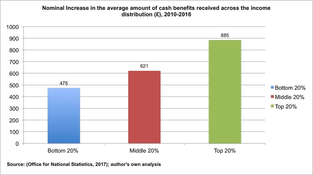
It’s been revealed that since 2010 the government has increased the amount of state benefits to the richest 20% of the UK by an average of more than six times that of the poorest. This has meant an effective real-terms cut for the poorest, but a real-terms increase for the richest. Most of the benefits come from the Department for Work and Pensions (DWP).
But the author of the analysis says it’s no accident. He thinks it’s a result of a “politically selective choice” by successive governments.
Groundbreaking research?
Daniel Edmiston is a sociology and social policy lecturer at the University of Leeds. He has produced research into the distribution of direct cash benefits paid out by the government, in terms of a household’s income. He says that the results show that, contrary to popular belief, the social security system is not as cut-and-dried as those who ‘pay in’ versus the government ‘paying out’ to those that don’t. And his figures support his argument.
Using data from the Office for National Statistics (ONS), Edmiston analysed the actual cash increases of almost all benefit payments between 2010 and 2016. These include all Department for Work and Pensions (DWP), HMRC and other government benefits:
- Jobseeker’s allowance
- Employment and support allowance
- Incapacity benefit
- Income support
- Maternity pay
- Child benefit
- Tax credits
- Housing benefit
- State pension
- Pensions credit
- Widows’ benefits
- War pensions
- Carer’s allowance
- Attendance allowance
- Disability living allowance
- Personal independence payment
- Severe disablement allowance
- Industrial injury disablement allowance
- Student support
He combined the benefit cash increases seen each year. Edmiston then found that the richest 20% of households saw the biggest average cash increase in benefit payments: £885 across the six years, compared with a £475 increase for the poorest 20% of households:

The research showed a 7% increase in benefit payments for the poorest household between 2010 and 2016. It showed a 10% increase for middle income ones. But worryingly it found a 44% increase for the richest – over six times that of the poorest. And when inflation is taken into account, Edmiston says that:
This amounts to real-term cuts to social security for those at the bottom and real-term increases for those at the top.
Nothing new under the sun
Edmiston told The Canary that he conducted the research because:
The general public are highly misinformed about who contributes to and who benefits from the welfare state. Exploring what different groups have received through social security reforms over time reveals inconsistencies in the government’s austerity agenda and how we tend to think about welfare spending. Despite popular belief, the evidence suggests that we are all ‘welfare dependent’. With that said, the real-terms amount of social security received for low-income households has fallen on average and increased for middle and high-income households since 2010.
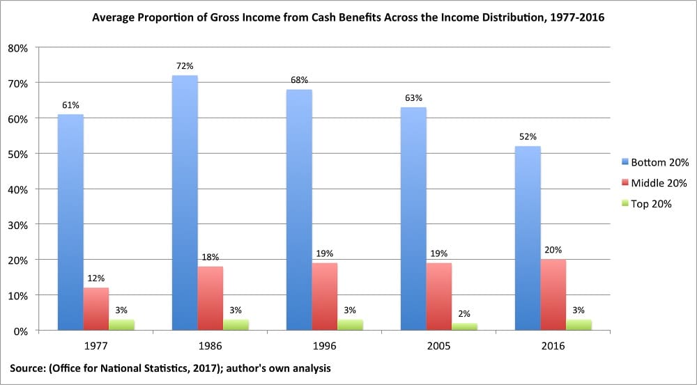
But this trend of falling cash benefits for the poor is not new. As Edmiston found, there has been a slow but noticeable change in the distribution of benefits since 1977. Essentially, the proportion of income that benefits make up has increased for middle income households. But it decreased by 20 percentage points in 2016 from its peak in 1986 for the poorest:

But digging deeper into Edmiston’s research, The Canary found it shows some worrying trends. It shows that some benefits are progressive (the government is paying them to the people who need it most), but that others were regressive (disproportionately going to the richest).
For example, the increase in statutory maternity pay in 2016/17 for the richest households was over seven times more than that for the poorest. The increase in disability living allowance was nearly twice as much for middle-income households than for the poorest. Also, the personal independence payment is a non-means tested benefit and should be broadly similar for everyone. But it saw the biggest increase in the middle income bracket. Benefits like jobseeker’s allowance, though, did seem to be going to the right income groups; albeit with tiny increases.
So what does the research mean?
The DWP and the government say…
The Canary asked the DWP for comment. It said that it was the Treasury’s area of responsibility. The Treasury then told The Canary it was the DWP’s area of responsibility. At the time of publication neither department had responded.
Edmiston told The Canary:
There are two key elements that have caused substantial shifts in the take up and receipt of social security. These are firstly the changing quality of work for different groups. But also the relative protection of benefits for older people over others. Middle income households are becoming increasingly reliant on tax credits to top up their incomes amidst stagnating wages. Meanwhile older people are enjoying relative increases in their pensions. As a result of these changes, children, women, disabled people, Black, Asian and Minority Ethnic groups and working-age people are being disproportionately disadvantaged.
Edmiston’s research is staggering. While the public has been fed a narrative of ‘living within our means’, coupled with ‘benefit porn’ filling TV schedules, the reality is very different. That the richest 20% have seen such high average increases, while the poorest have seen a real terms cut, is politically damning. But it also shows that the ‘welfare state’ is no longer fit for purpose.
Get Involved!
– Join The Canary, so we can keep holding the powerful to account.
Featured image via UK government – Wikimedia


